css animation
요소의 현재 스타일을 다른 스타일로 변환
@keyframe
시작: 0%, from
과정: 1%, 3%, 10%, ..
끝: 100%, to
0% 5% 10% ... 100%
장면1 장면2 장면3 ... 끝장면
속성
animation-name: 애니메이션 이름을 설정
animation-fill-mode: 애니메이션이 끝난 후 어떻게 처리할지 설정
forwards: 애니메이션 키프레임이 완료 되었을 때 마지막 프레임으로 유지
animation-direction: 애니메이션의 진행 방향을 정하는 속성
reverse: 반대 순서로 진행
alternate: 정해진 순서로 진행했다가 다시 반대 순서로 진행
reverse-alternate: 반대순서로 진행했다가 다시 정해진 순서로 진행
animation-duraion: 애니메이션 일어나는 시간을 설정
animation-iteration-count: 애니메이션이 몇 번 반복할지 설정
infinite: 무한반복
숫자: 숫자만큼 반복
ex)
더보기
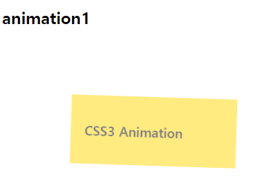

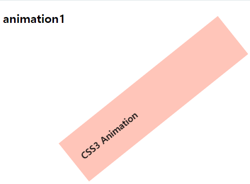
<!DOCTYPE html>
<html lang="en">
<head>
    <meta charset="UTF-8">
    <meta name="viewport" content="width=device-width, initial-scale=1.0">
    <title>animation1</title>
    <style>
        .box {
            margin-top: 100px;
            margin-left: 100px;
            padding: 20px;
            height: 60px;
            animation-name: moving;
            animation-duration: 3s;
            animation-iteration-count: infinite;
            animation-direction: alternate;
        }

        @keyframes moving {
            from {
                width: 200px;
                background-color: gold;
                opacity: 0.5;
                transform: rotate(0deg);
            }
            to {
                width: 400px;
                background-color: pink;
                opacity: 1;
                transform: rotate(360deg);
            }
        }
    </style>
</head>
<body>
    <h2>animation1</h2>
    <div class="box">
        <h3>CSS3 Animation</h3>
    </div>
</body>
</html>
아래의 형상이 무한반복
'AI기반 챗봇 및 OCR 개발 > 웹\css' 카테고리의 다른 글
| CSS: 2D (0) | 2024.04.12 |
|---|---|
| [24일차] CSS: 우선순위/ custom properites(속성값 재사용) (0) | 2024.04.12 |
| CSS: 반응형 웹 예시 (0) | 2024.04.11 |
| CSS: 미디어 쿼리 (0) | 2024.04.11 |
| CSS: 레이아웃 & 플렉스 (0) | 2024.04.11 |